
Northwater Lodge, a lakeside resort.
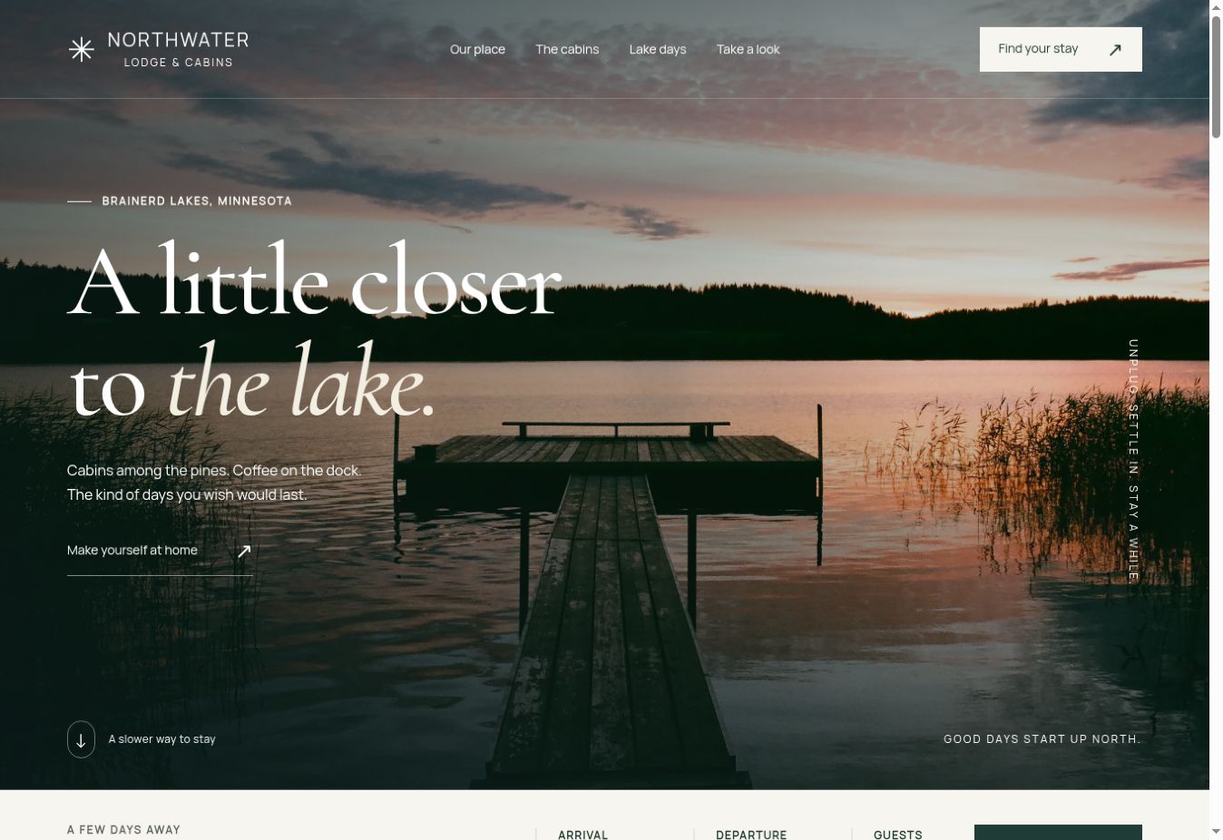
Set here, on purpose. Three cabins, a lake at sunset, and the two questions every guest actually has: is this the kind of place I want to spend a weekend, and which cabin fits the people coming with me?
Why this one is on this site
Northwater is not a real resort. It is a concept I built to work out how a lakes area resort site should behave, and it is here because it is the closest thing on my portfolio to the job most people reading this page actually have.
The order matters more than anything else on it. A guest asks do I want to be there before they ask which cabin, and a site that leads with a rates table has answered the second question to somebody who never asked the first. So the page opens on the water and earns the right to talk about bedrooms.
Three stays, and the difference is obvious
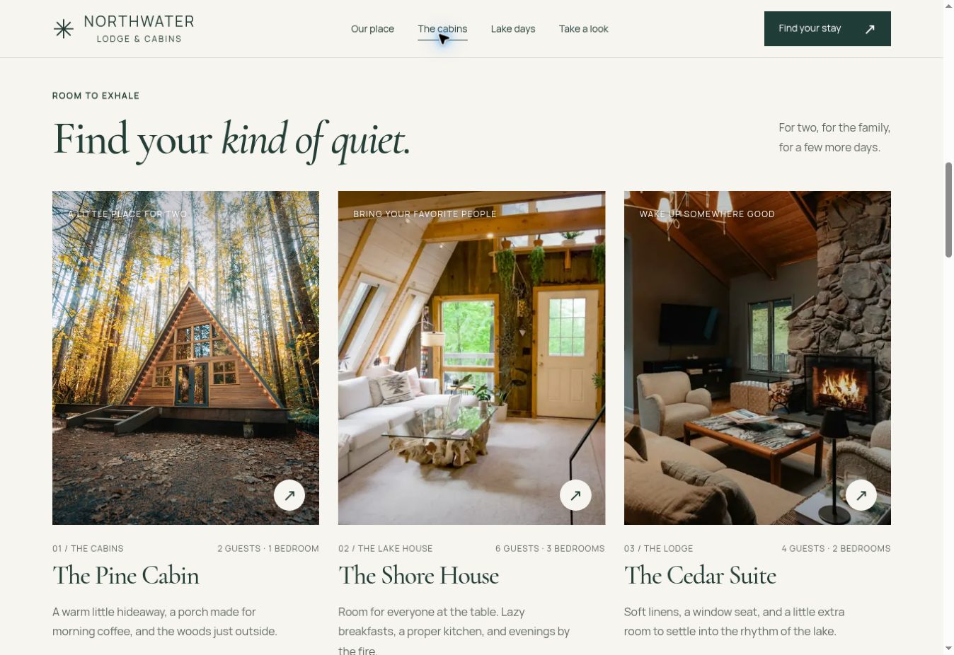
The Pine Cabin sleeps two, the Cedar Suite four, the Shore House six. Guest counts and bedrooms sit next to the names rather than three clicks in, because the single most common way a resort site loses somebody is making them open every cabin to find out which one fits their family.
That is the change I would make to most existing resort sites before I touched anything else, and it usually costs nothing but a rewrite.
A planner instead of a booking engine
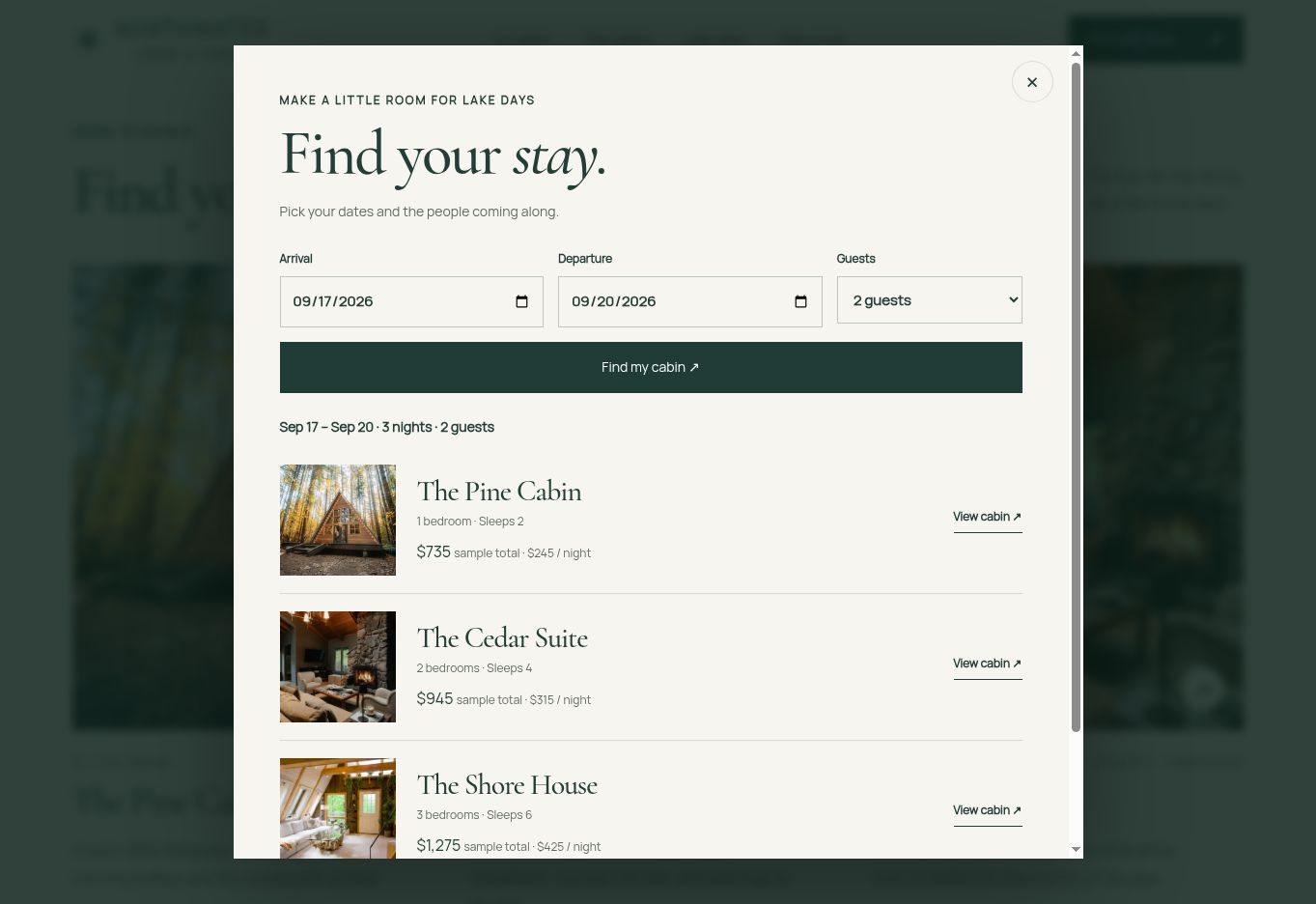
The planner takes arrival, departure and party size, filters out the cabins that do not fit, and works out a sample total for the nights chosen. It is reachable from the header and from the date strip, so a guest can start it from wherever they happen to be on the page.
What it deliberately is not is a booking system. There is no real availability behind it, no payment, and the demo says so plainly. That is the honest version of what most small resorts need: something that helps a guest work out what they want and then hands them to a person, rather than an expensive calendar widget that leaves your awkward midweek gaps sitting empty.
It has to survive a phone in a car park
The mobile layout keeps the lake photograph and the headline prominent, drops the cabins to one column, and rearranges the planner controls so they still work with a thumb. That is not a nice-to-have up here: a large share of the people looking at your resort are doing it on a phone, sometimes on one bar, sometimes in a driveway with the engine running.
The photography is real and the photographer credits stayed in the site. It sets the mood of a concept; it does not document an operating resort, and pretending otherwise would be the exact thing I tell clients not to do.
What I would take from this to your resort
Three things, and none of them are the design. Put capacity next to every cabin. Make the enquiry work in February, when the deciding actually happens. And be honest about whether you need a booking engine at all, because most places this size do better with a form and a phone call. The resort page goes through all three properly.
Want yours to work like this?
A new business package is $699 and a custom site with a page per cabin starts at $1,495. Tell me how many units you have and I will send the number within 24 hours.